" UMAMI "
BRAND IDENTITY PROJECT
BRAND IDENTITY PROJECT
DESCRIPTION
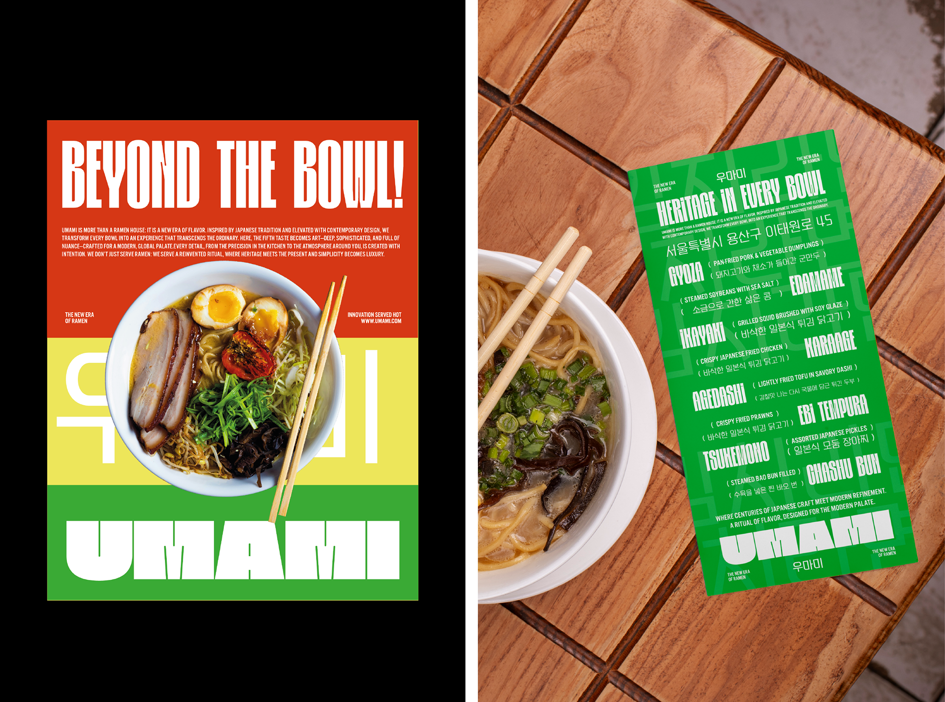
UMAMI is a modern ramen house that redefines tradition — a bold meeting point between Japanese heritage and contemporary design. Rooted in the belief that ramen should be more than a meal, UMAMI elevates every bowl into a crafted ritual, where flavor, culture, and innovation converge. Each recipe is a symphony of depth and balance, celebrating the “fifth taste” as an art form. Here, dining goes beyond the bowl — it becomes an immersive experience of richness, craftsmanship, and story. UMAMI is for those who seek not just to eat, but to savor, connect, and discover ramen in a new era of flavor.
UMAMI is a modern ramen house that redefines tradition — a bold meeting point between Japanese heritage and contemporary design. Rooted in the belief that ramen should be more than a meal, UMAMI elevates every bowl into a crafted ritual, where flavor, culture, and innovation converge. Each recipe is a symphony of depth and balance, celebrating the “fifth taste” as an art form. Here, dining goes beyond the bowl — it becomes an immersive experience of richness, craftsmanship, and story. UMAMI is for those who seek not just to eat, but to savor, connect, and discover ramen in a new era of flavor.
VISUAL IDENTITY
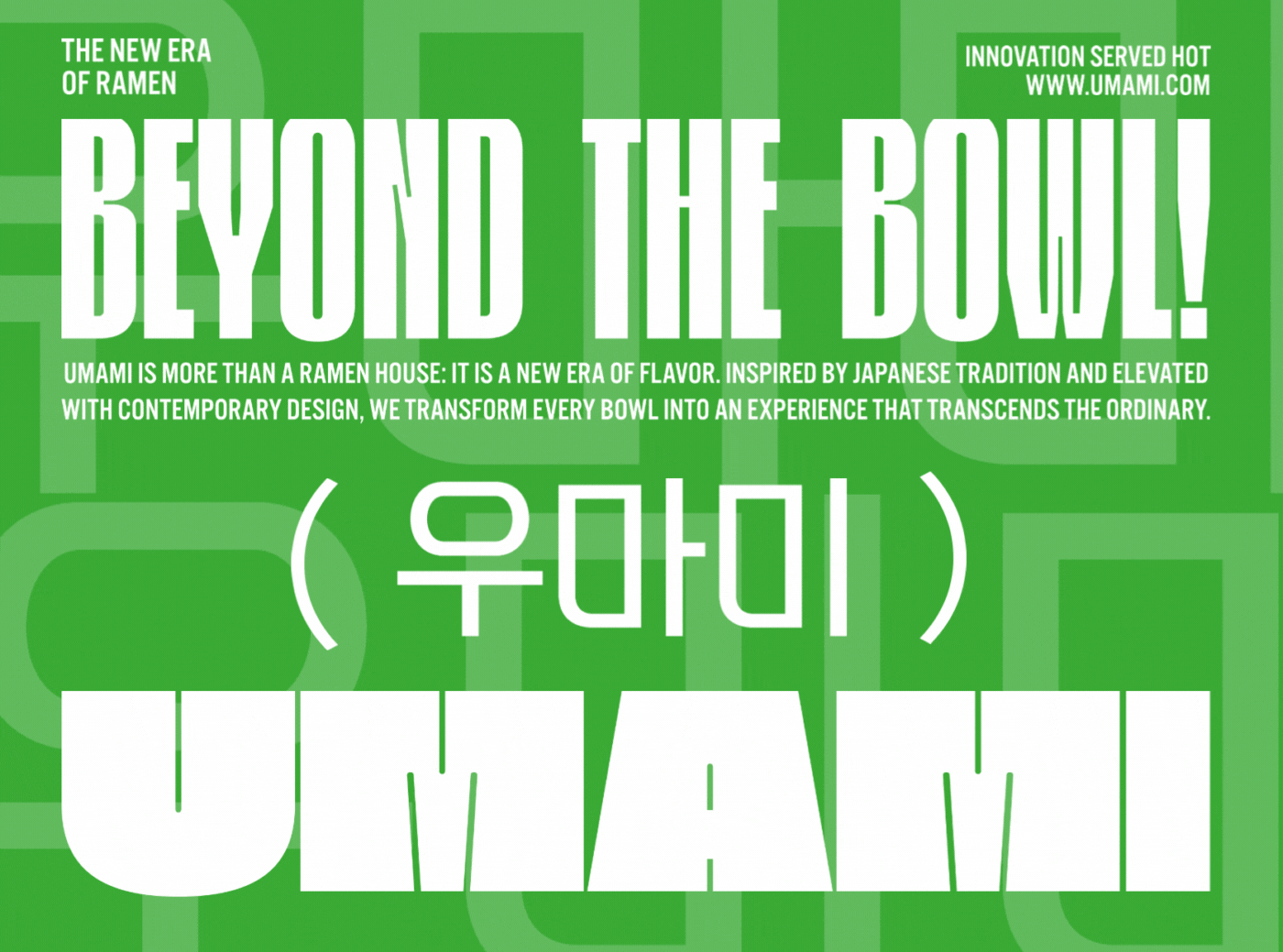
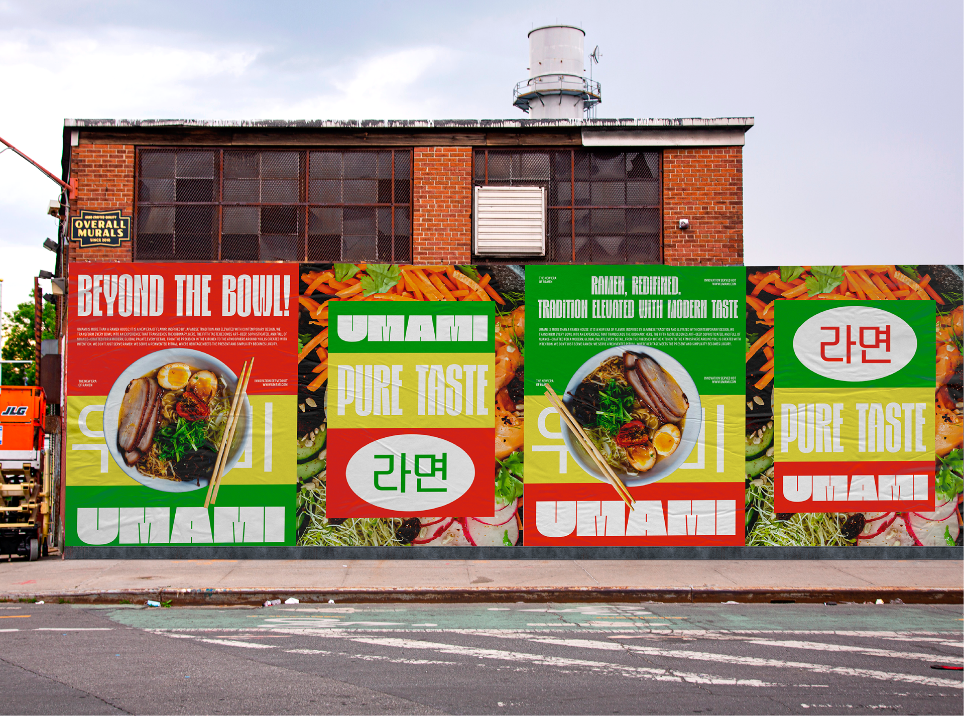
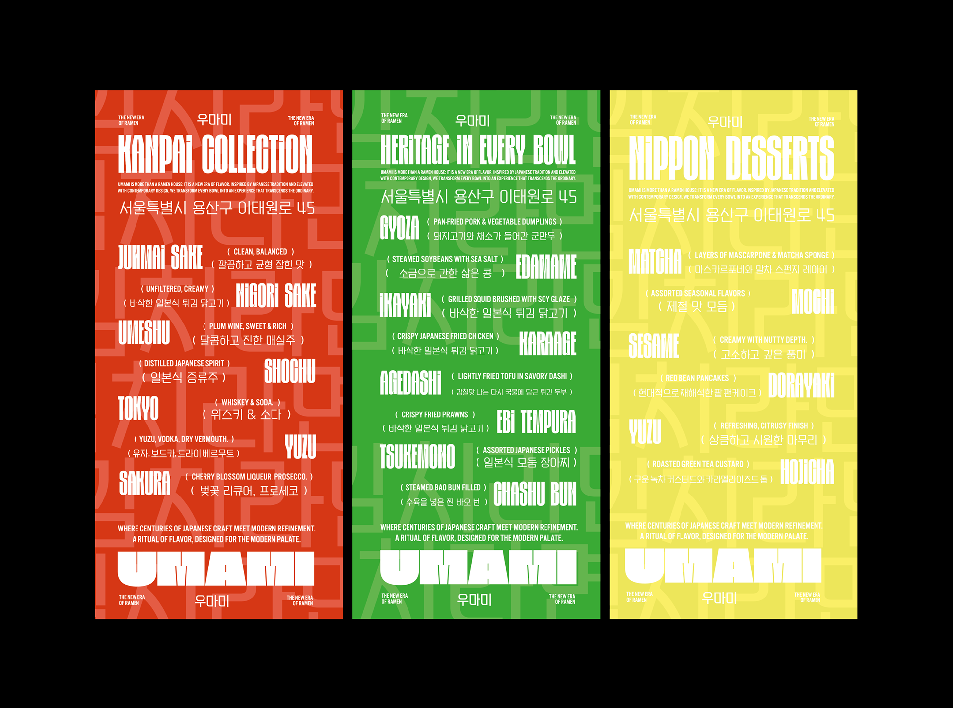
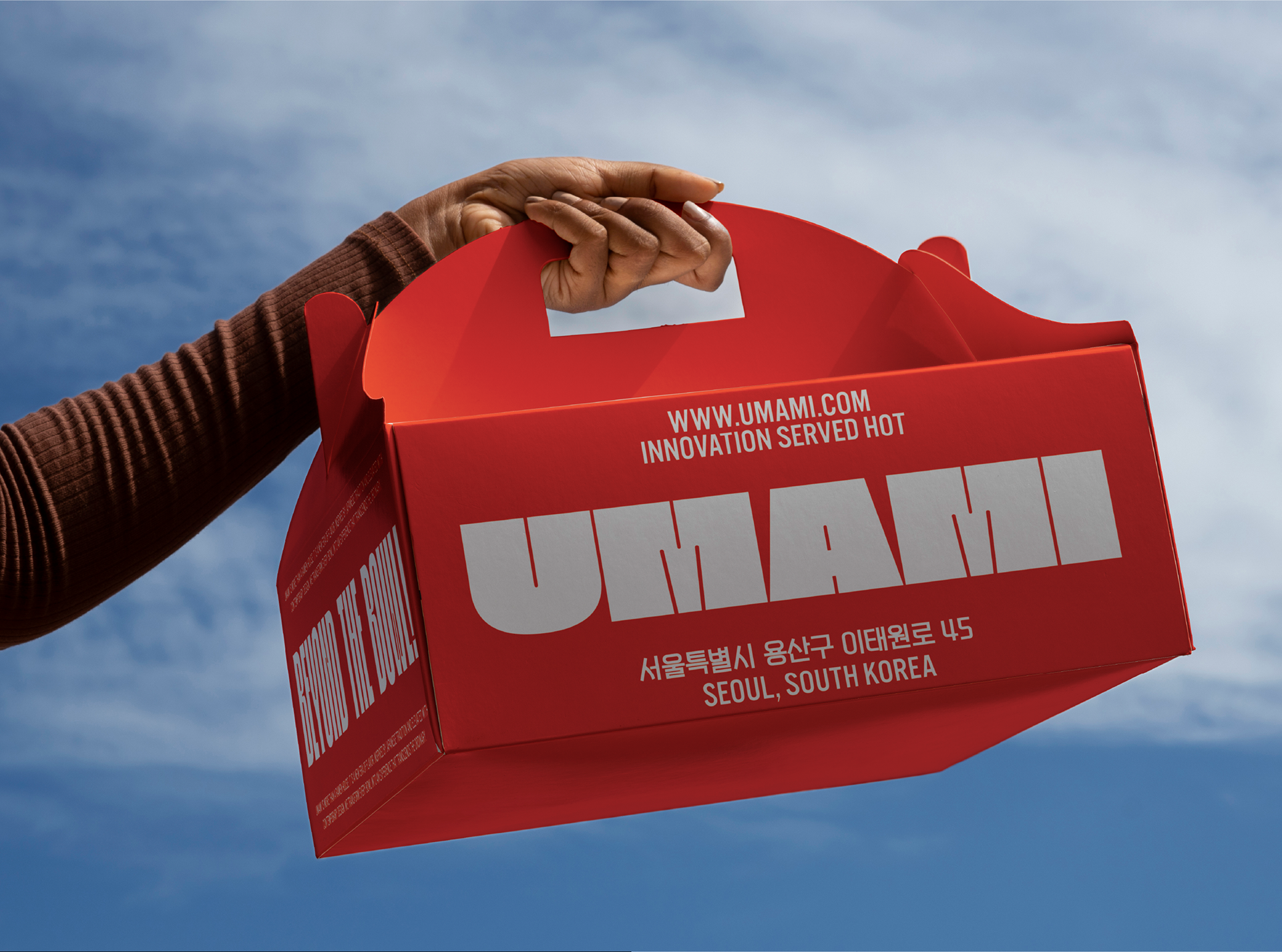
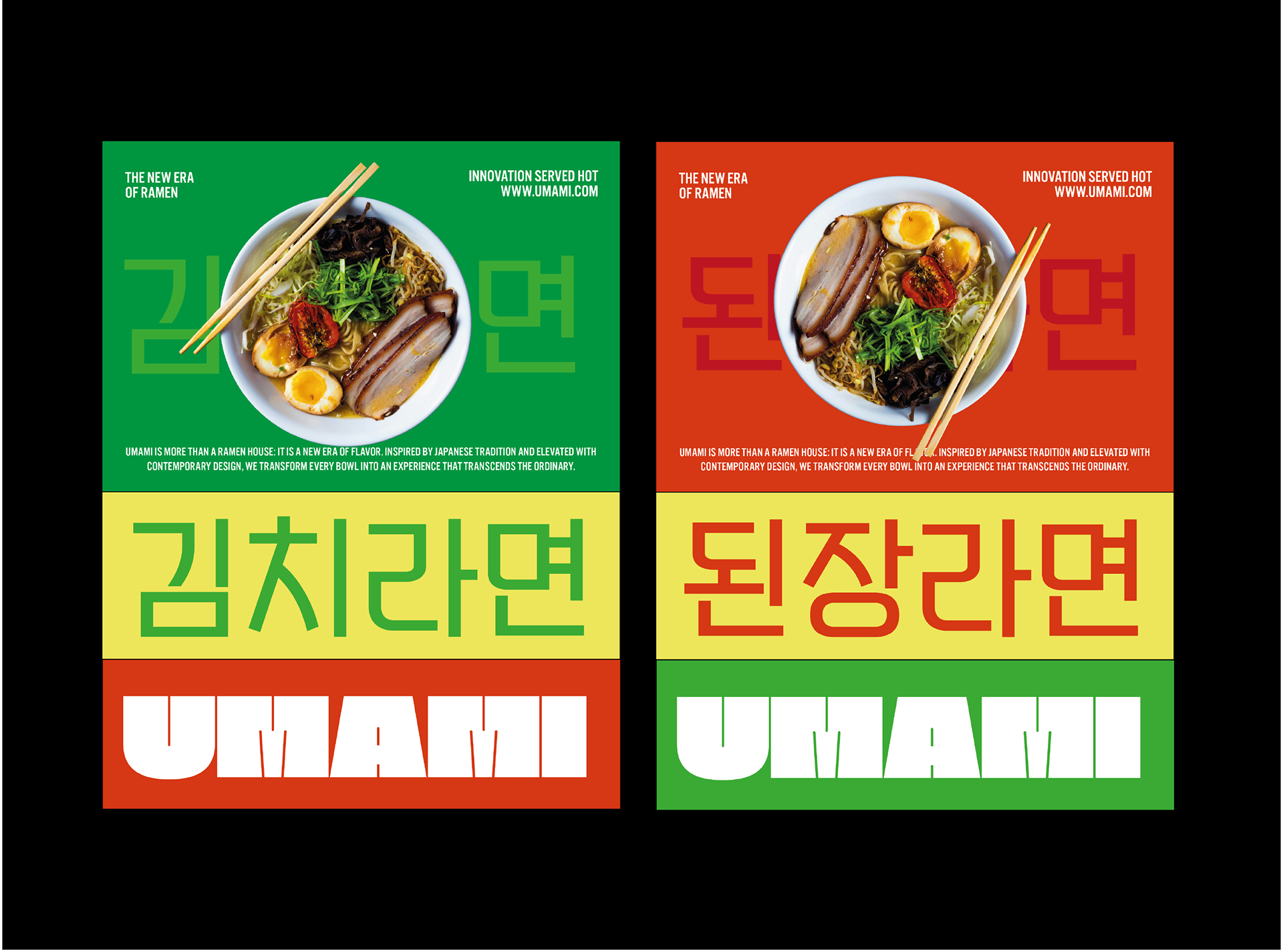
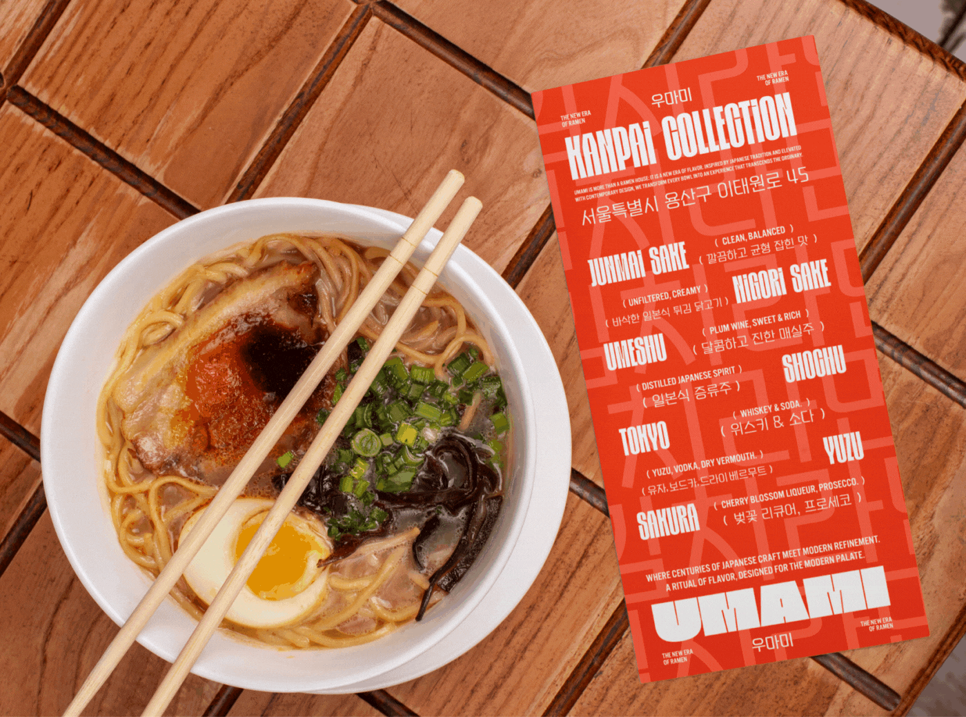
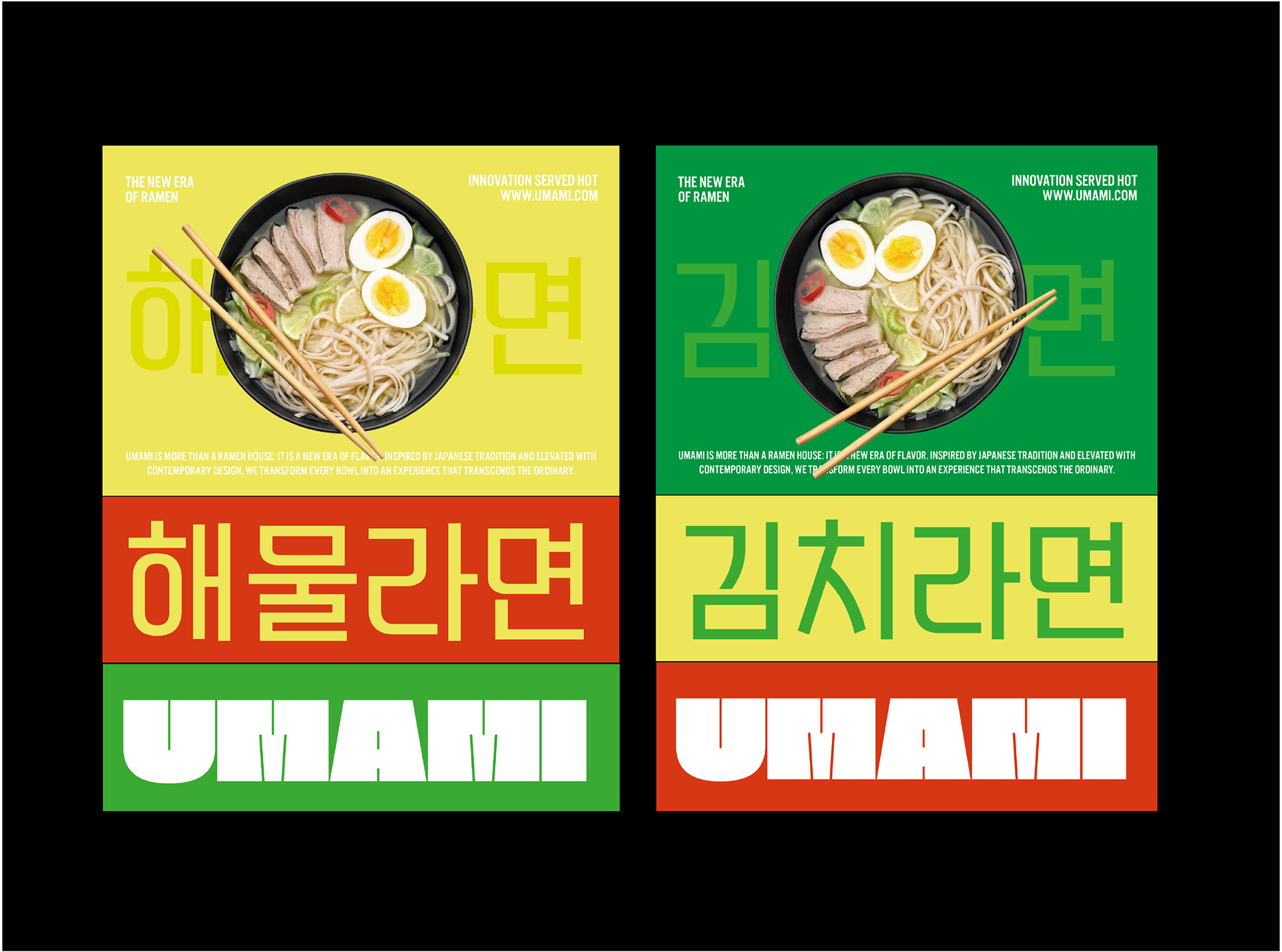
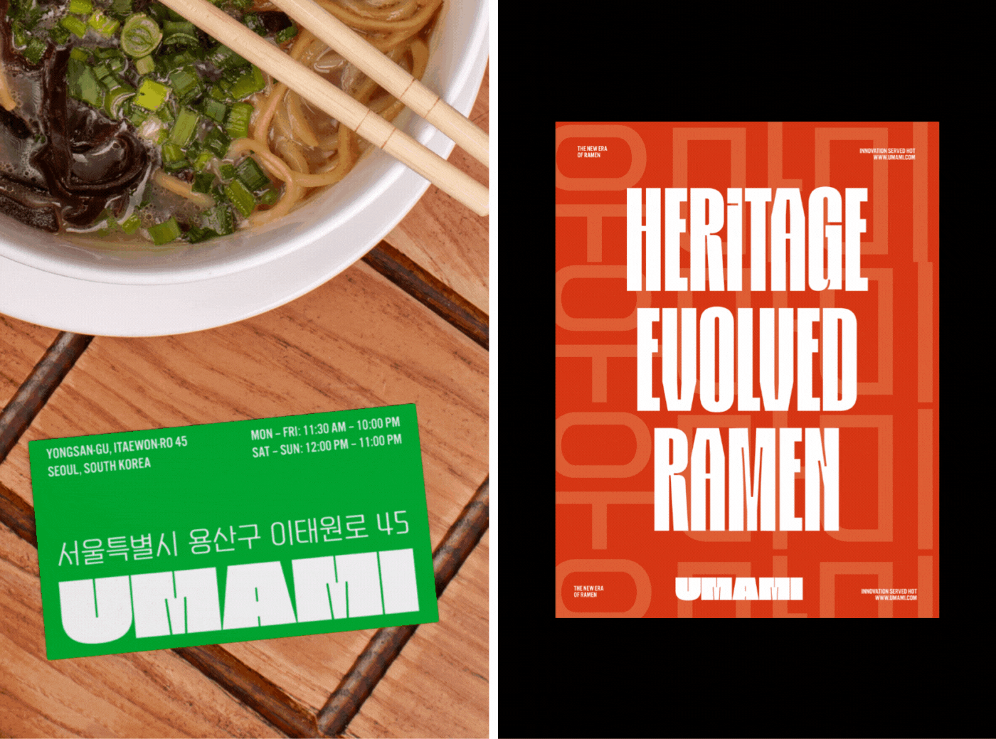
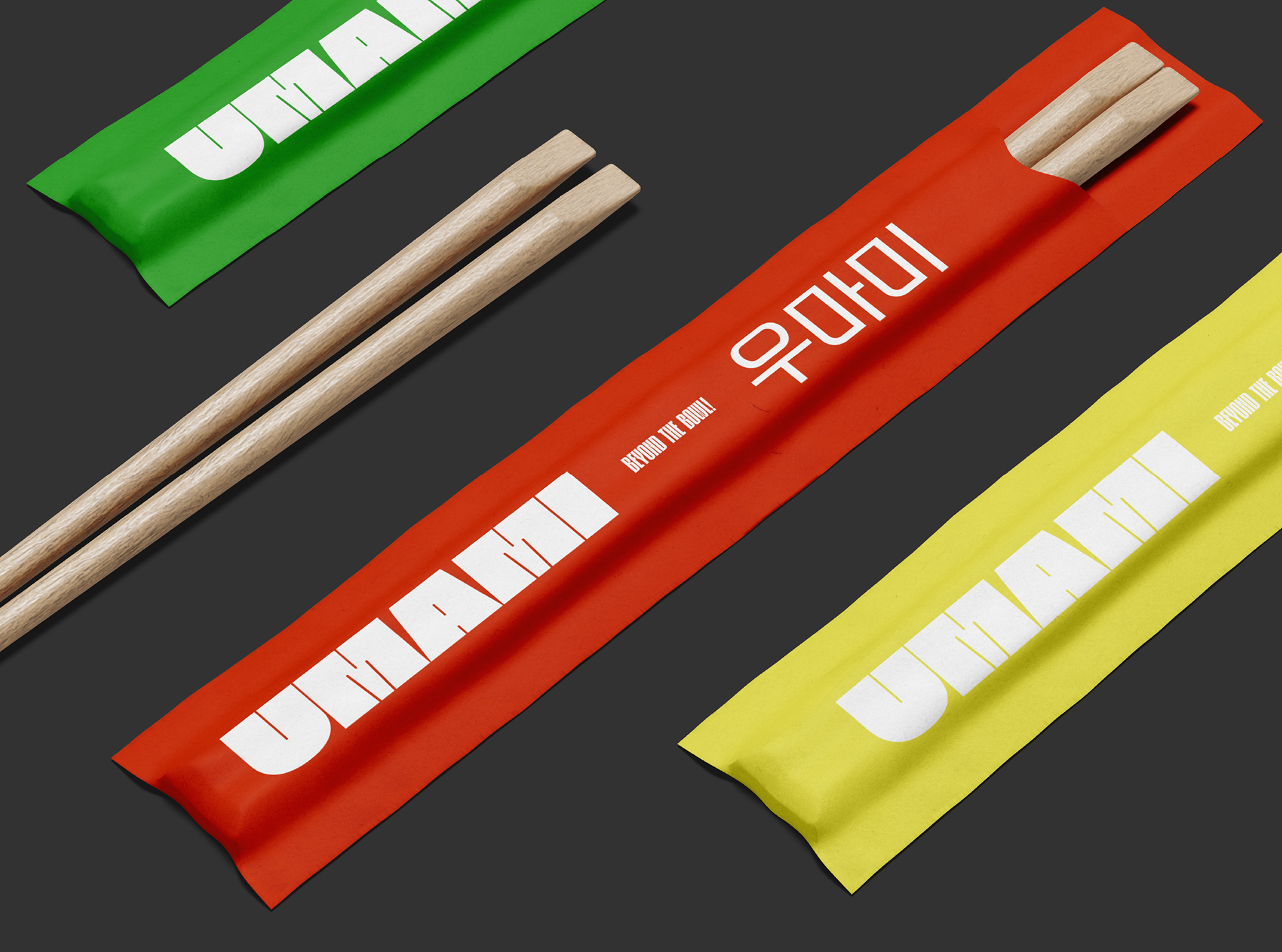
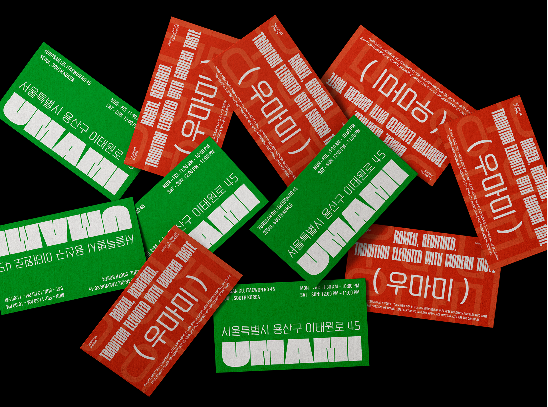
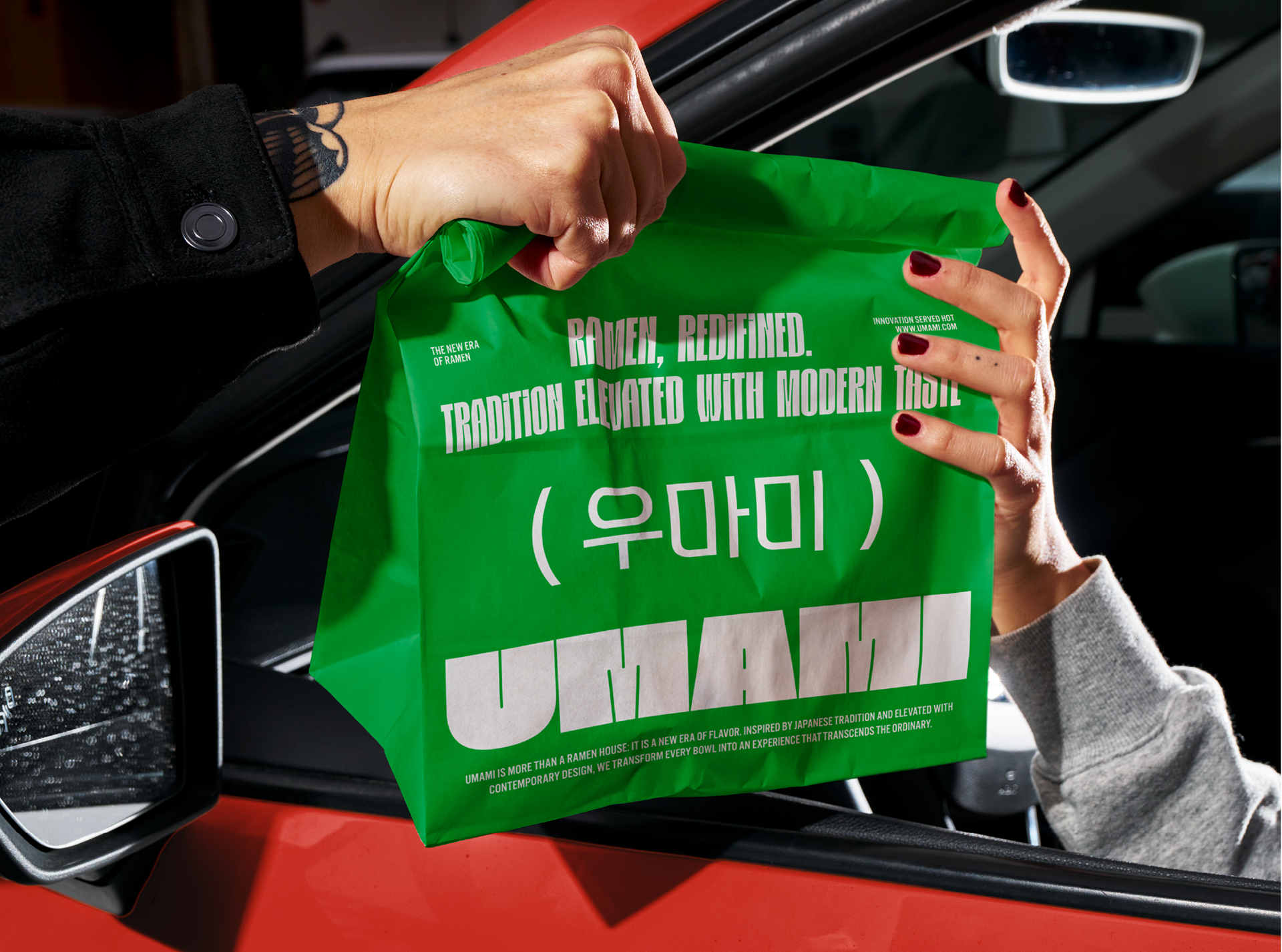
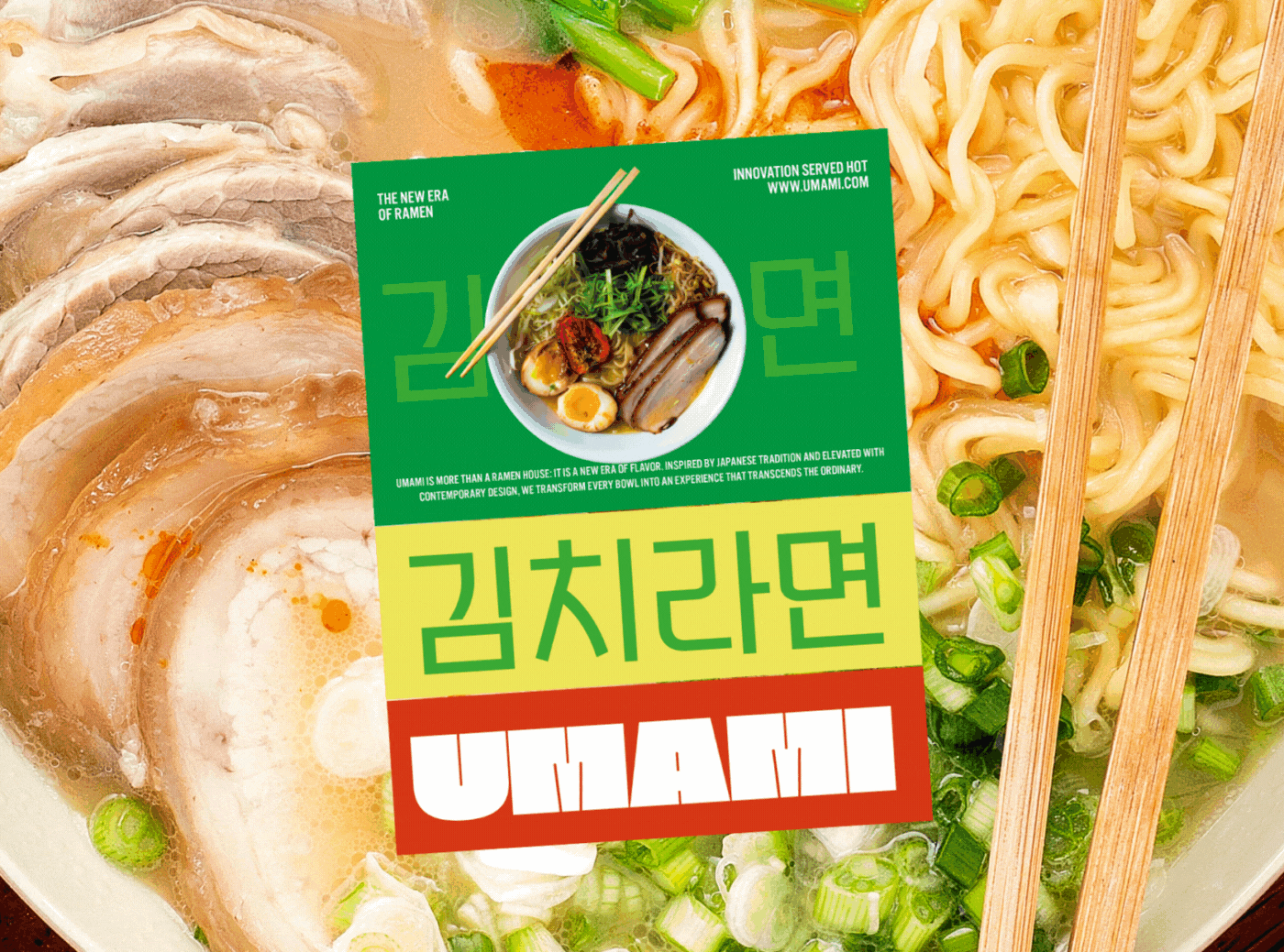
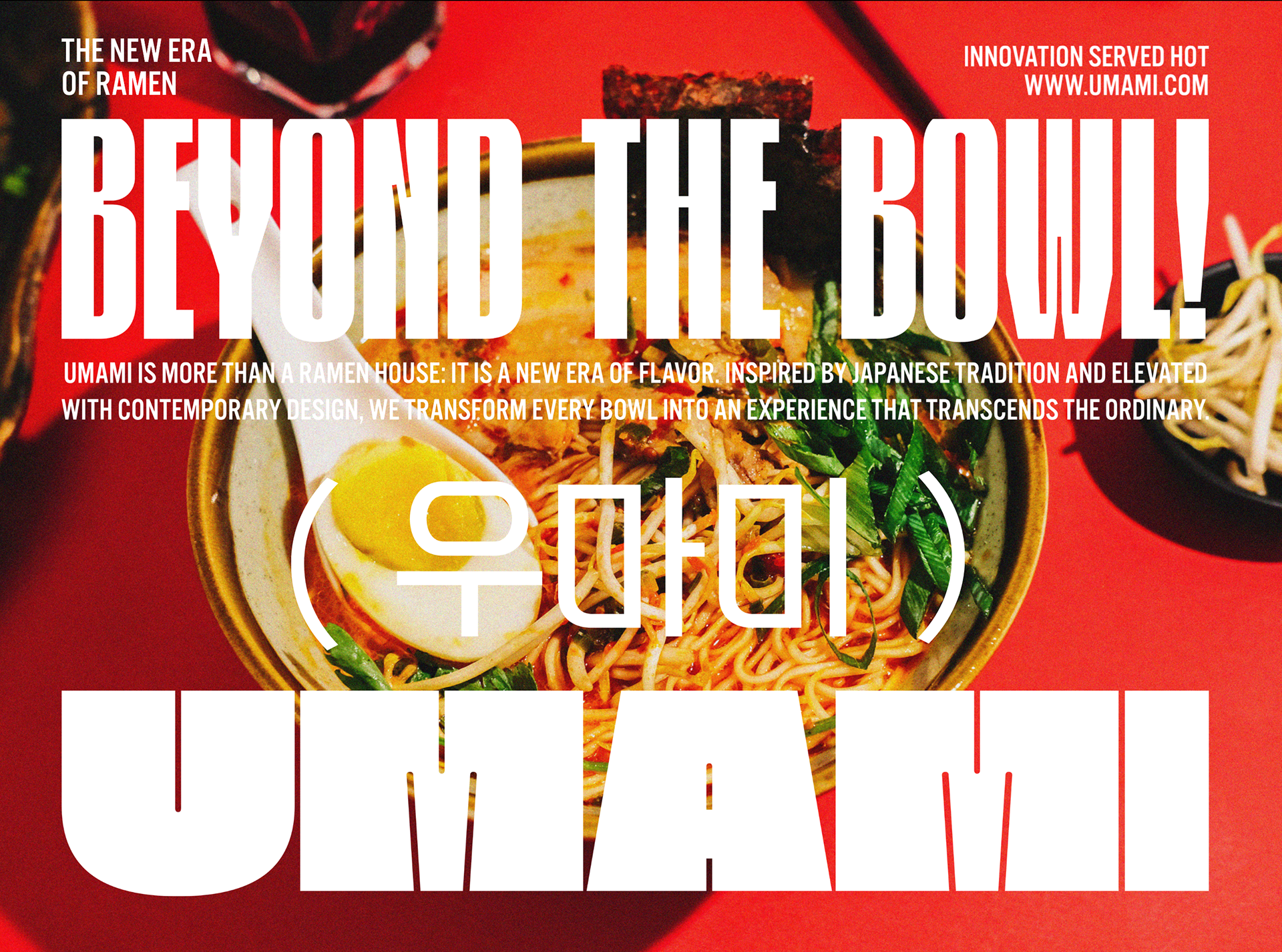
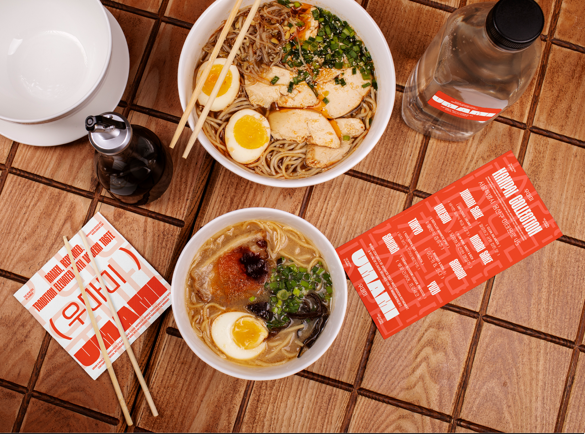
UMAMI’s visual identity is an energetic fusion of bold typography, vibrant contrasts, and cultural references. The oversized, blocky logotype anchors the brand with strength and modernity, while a vivid palette of fiery red and electric green captures the intensity of flavor and freshness. Korean and Japanese scripts are integrated seamlessly, emphasizing authenticity and cross-cultural spirit. Taglines like “Innovation Served Hot” and “Beyond the Bowl” position UMAMI as both playful and elevated. Packaging, menus, and collateral echo the same dynamic personality — designed not just to inform, but to excite and seduce the senses. The result is a brand system that feels fresh, powerful, and unforgettable, much like the ramen it represents.
UMAMI’s visual identity is an energetic fusion of bold typography, vibrant contrasts, and cultural references. The oversized, blocky logotype anchors the brand with strength and modernity, while a vivid palette of fiery red and electric green captures the intensity of flavor and freshness. Korean and Japanese scripts are integrated seamlessly, emphasizing authenticity and cross-cultural spirit. Taglines like “Innovation Served Hot” and “Beyond the Bowl” position UMAMI as both playful and elevated. Packaging, menus, and collateral echo the same dynamic personality — designed not just to inform, but to excite and seduce the senses. The result is a brand system that feels fresh, powerful, and unforgettable, much like the ramen it represents.
Brand Identity Design, Packaging Design and Art Direction
Sonia Monreal
2025
Sonia Monreal
2025